Every brand has a voice and every voice deserves harmony. A style guide creates that harmony through design, tone, and order. It speaks for the brand when people cannot. It whispers identity through every font, colour, and line.
Creating a website style guide demands attention and creativity. It also requires curiosity and discipline. It is not only design but a strategy dressed in colour and typography. If you wish to build a style guide for your web design in Perth, this guide will help you in 10 steps.
Step 1: Define the Brand Core
Before shapes and colours come meaning. The core of a brand sits in its soul, so begin with questions. Who are you? What values shape your identity? What mood defines your message? Describe the brand as if it were a person. Clarity at this stage simplifies every decision later.
Write a short mission statement—Keep it sharp and truthful. This mission becomes the foundation of your visual and verbal tone. It tells designers and writers where to start and where to stop.
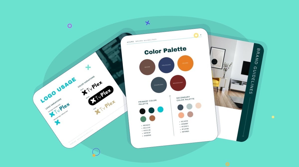
Step 2: Craft a Distinct Colour Palette
Colour is emotion in visual form. It triggers responses faster than words. A strong palette defines atmosphere and mood.
- Start with one primary colour to represent your identity.
- Select secondary colours to support the primary hue. These shades create balance. They offer flexibility for banners, icons, and highlights.
- Add neutral tones like white, grey, or beige. They calm the eye and offer space for stronger colours to breathe.
Document every colour code with HEX and RGB values. No designer should ever guess your shade.
Step 3: Select Typography That Matches the Brand Voice
Typography is the accent of communication. It expresses attitude through structure and shape.
Choose a primary font for headlines. It carries the brand’s confidence.
Pick a secondary font for body text. It must feel easy on the eyes and not distract from meaning.
Establish hierarchy with headings, subheadings, and paragraphs. Readers should know the importance of different elements just by sight.
Typography must also breathe, so add line spacing that feels generous, not tight. Letters should rest comfortably beside each other.
A consistent typographic system forms a visual rhythm.
Step 4: Define Logo Rules
The logo stands as the crown of identity. It carries legacy in a single mark. So, display the correct logo versions. Include full colour, black, white, and simplified forms. Each version suits a different background.
Set clear instructions for size. A logo too small loses power, while a logo too large dominates unnecessarily. You can also include examples of incorrect use. Show what never to do. No stretching. No rotating. No recolouring. These errors damage recognition.
Step 5: Establish Image and Illustration Standards
Images communicate emotion instantly. They define tone faster than text. So, decide what kind of images fit your brand. Authentic or stylised? Warm or cool? Abstract or literal?
- If photography dominates, define lighting style—Natural light or studio light.
- For illustrations, decide on texture and shape. Minimal lines or detailed drawings.
- Demonstrate ideal framing, subject focus, and filter use.
Consistency in imagery keeps the narrative unified on your web design in Perth.
Step 6: Define the Tone of Voice
Design speaks visually and the voice speaks emotionally. Together they complete identity. So, define how your brand sounds. Serious or friendly? Poetic or direct? Refined or rebellious?
Create examples for headlines, taglines, and body content. Show sentence length and rhythm. If your tone uses humour, describe its limits. A voice must stay consistent across platforms. It should sound identical on a webpage, email, or caption.
Your tone builds personality for your web design in Perth
Step 7: Structure Layout and Spacing
Layout creates order. It shapes how the eye travels through content. That is why it’s key to define grid systems for balance. Specify column widths, padding, and margins, as each measurement preserves structure. A website with harmony feels trustworthy.
Whitespace acts like oxygen, separating elements and giving importance to what matters most. So, do not fear empty space. Silence adds power to sound.
Step 8: Set Iconography and Button Guidelines
Icons may appear small, yet they hold meaning. They serve as navigation guides and visual language.
- Select one icon style—Outlined, solid, or flat. Never mix.
- Define icon size and colour. These details unify design across devices.
- Set clear rules for button shape, border radius, and text alignment.
- Add hover effects for feedback. Subtle motion enhances user delight.
- Avoid exaggeration. Movement must feel natural.
Step 9: Explain Motion and Interaction Design
Motion brings design to life. It transforms static visuals into experiences. Hence, you should define when and where to use animation. But use it to guide attention, not to distract.
- Specify timing. Short transitions feel snappy, while long transitions feel elegant.
- Describe acceptable effects—fade, slide, or bounce.
- Avoid flashing or erratic motion. Subtlety strengthens sophistication.
Explain how users should feel after each interaction. Calm? Excited? Inspired? Motion becomes emotion. The guide must preserve that emotion consistently for your web design in Perth.
Step 10: Create an Accessible Format
A style guide should be easy to read, navigate, and update. Organisation strengthens adoption.
- Divide the guide into clear sections with labels and indexes.
- Online platforms like Figma, Notion, or Webflow host style systems with ease. They allow collaboration and instant updates.
- Add downloadable files for logo packs, colour swatches, and font links. Convenience encourages adherence.
The best guide is the one people enjoy using.
Conclusion
A website style guide is not decoration. It is direction. It acts as a compass for design and voice. It keeps branding aligned across projects and platforms. Every decision in a guide—colour, type, spacing, tone—adds weight to identity. Together they build a cohesive world where everything speaks the same language.
If you want a more experienced take on your web design in Perth, you can connect with Make My Website. Everything will become much easier with their insights.